Color-Only Meaning
Do not make color carry the whole message. Pair color with text, shape, labels, icons, or patterns so the meaning is available to everyone.
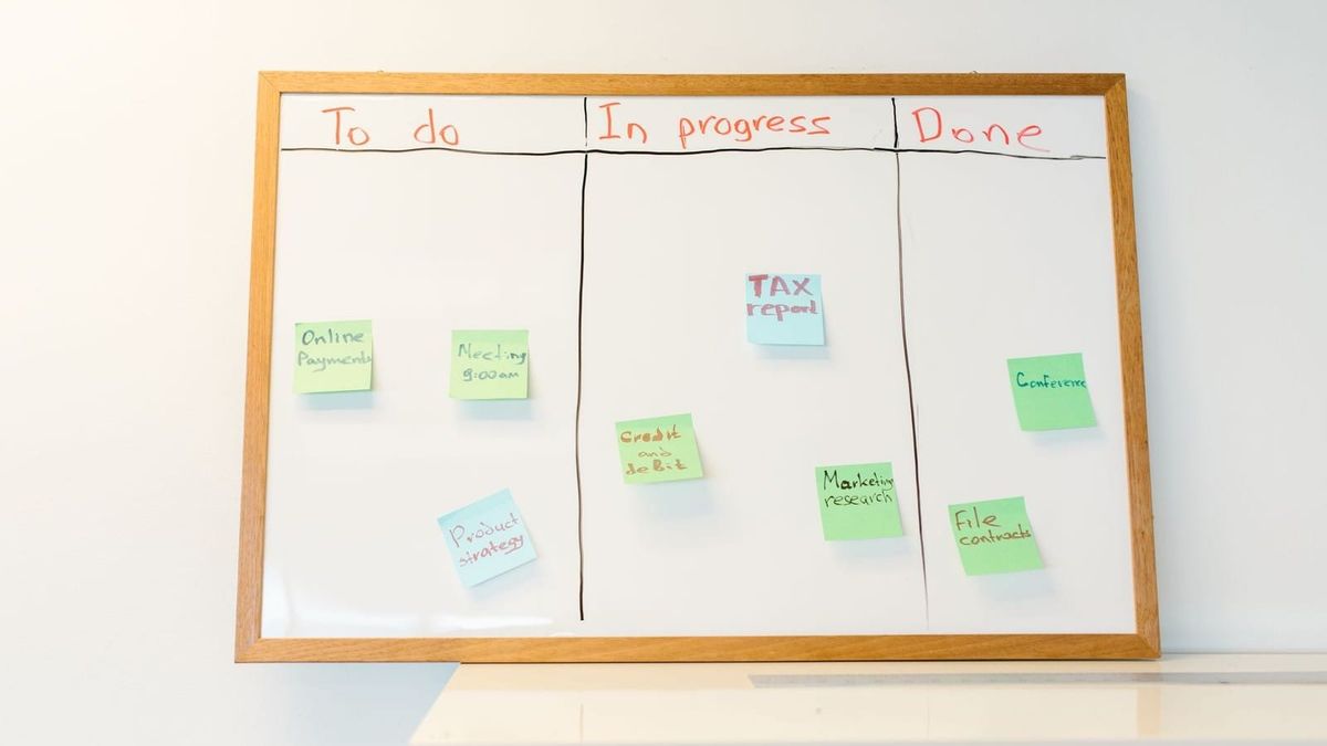

Color is useful. It can draw attention, group related things, show status, and help people scan a screen quickly.
The accessibility problem starts when color is the only thing carrying the message.
If the only difference between success and error is green versus red, some users will miss it. If the only way to tell which fields are required is a color change, some users will have to guess. If a chart depends only on colored lines, the trend may disappear for someone who cannot distinguish those colors, prints the page in grayscale, uses high contrast settings, or views the screen in poor lighting.
A safer pattern is simple:
Use color as a cue, but do not make it the only cue.
The common project moment
A team adds visual polish to a screen, dashboard, report, form, or workflow.
Color helps the page feel clearer:
- errors are red
- success messages are green
- warnings are yellow
- disabled items are gray
- selected tabs have a different color
- required fields use a colored label
- charts use different colored lines
- maps use colored regions
- status chips use colored backgrounds
At a glance, the design feels understandable.
Then someone asks what happens if the color is not available, not distinguishable, or not enough.
That question often reveals that the page is asking users to decode meaning from color alone.
The review question is not, "Does this use color?"
It is:
Would the meaning still be clear if the color disappeared?
Use this when
Use this page when a screen, document, chart, or workflow includes:
- form errors or validation states
- required-field indicators
- selected, active, disabled, complete, overdue, or unavailable states
- charts, graphs, maps, and dashboards
- status chips, badges, pills, or labels
- icons that change color to show meaning
- tables that use colored cells to show risk or priority
- calendar views, schedules, queues, or Kanban boards
- instructions that say things like "items in red" or "green means approved"
This applies to web apps, PDFs, slide decks, reports, emails, dashboards, and internal tools.
Start by naming the meaning
Before checking the color, name what the color is trying to communicate.
Ask:
- Does this color mean error, warning, success, required, selected, disabled, overdue, approved, blocked, complete, or something else?
- Is the meaning written anywhere nearby?
- Is the same color used for more than one meaning?
- Would someone understand the state if the screen were printed in grayscale?
- Would someone understand it in high contrast mode?
- Would someone understand it through a screen reader or other non-visual path?
If the team cannot describe the meaning without pointing at the color, the design probably needs another cue.
Pair color with text
Text is often the simplest fix.
Instead of relying on a red border alone, add an error message.
Instead of using a green dot alone, add a label such as Approved, Complete, or Available.
Instead of showing a yellow badge with no words, add Needs review or Warning.
This does not mean every color needs a long explanation. It means the important state should have a name.
Useful patterns include:
Error: Email address is required.Status: Approved3 overdue tasksSelected: Monthly reportUnavailable until all required fields are complete
The text can be visible on the page, included in an accessible name, or exposed through a clear table header, legend, label, or summary.
Pair color with shape, icon, pattern, or position
Sometimes text is not the only supporting cue.
A design can also use:
- an icon plus a text label
- a thicker line or different dash pattern in a chart
- a selected tab underline plus text styling
- a required-field word instead of only a colored asterisk
- a table status column with words
- a map legend that uses labels and patterns, not just color swatches
- a calendar marker that uses text or shape in addition to color
The important part is that the second cue actually carries the meaning.
An icon that is only announced as icon does not help. A legend with colored boxes but no labels does not help. A pattern that is too subtle to notice may not help either.
Watch form errors and required fields
Forms are one of the easiest places to create color-only meaning.
Common problems include:
- required fields shown only with a red label
- error fields shown only with a red border
- valid fields shown only with a green checkmark
- instructions that say "fields in red must be corrected"
- disabled buttons shown only by gray color
A better form pattern names the issue directly.
For example:
<label for="email">Email address <span aria-hidden="true">*</span></label>
<p id="email-help">Required</p>
<input id="email" aria-describedby="email-help email-error">
<p id="email-error">Enter an email address.</p>
The visual design can still use color. The user does not have to rely on color alone to understand what happened or what to do next.
Watch charts, tables, and dashboards
Charts and dashboards often use color as shorthand.
That shorthand can fail when the chart has no labels, no data table, no direct annotations, or no text summary.
A color-only chart might show three lines in red, blue, and green, then expect the user to match those colors to a legend. A dashboard might show red, yellow, and green cards without naming the status. A table might shade cells to show risk but provide no text value.
Safer patterns include:
- direct labels on chart lines
- different line styles or markers
- text summaries of the main takeaway
- table values such as
High risk,Medium risk, andLow risk - legends that combine color with text and shape
- downloadable data or supporting tables when the visual carries important information
If the chart or dashboard matters, the conclusion should be available outside the color treatment.
Watch instructions that point only to color
Instructions often reveal the problem.
Phrases like these are warning signs:
Click the green button.Resolve the red items.Choose the blue option.Fields highlighted in yellow need attention.Green rows are approved.
Those instructions assume the user can perceive and distinguish the color exactly as intended.
A stronger instruction names the thing itself:
Select Continue.Resolve items marked Needs review.Choose Standard processing.Fields with the message Required need attention.Rows with Status: Approved are ready to submit.
Color can still support the instruction. It should not be the instruction.
Questions teams can ask
For design:
- What meaning does each color carry?
- Is there a second cue for every important state?
- Does the selected, active, error, disabled, or required state work without color?
- Are chart lines, dashboard statuses, and map regions labeled clearly?
For content:
- Do instructions name the actual control, status, or item instead of only the color?
- Are error and status messages written in text?
- Does the page explain what the color-coded categories mean?
For development:
- Are labels, names, descriptions, and table values exposed in markup?
- Do states remain understandable in high contrast or forced-colors modes?
- Are icons and status badges named when they carry meaning?
For QA/review:
- Can you understand the page in grayscale?
- Can you understand the page when color contrast or high-contrast settings change the palette?
- Can a screen reader user identify the same state or instruction?
- Does the page still make sense if the legend is separated from the chart?
Common trail hazards
- Using red and green as the only difference between failed and passed states.
- Showing required fields only through colored labels or colored asterisks.
- Styling selected tabs or filters only with a color change.
- Using color-coded table cells without text values.
- Giving a chart a legend that relies only on colored swatches.
- Writing instructions that refer only to "red," "green," "blue," or "yellow" items.
- Making disabled controls gray without explaining why the action is unavailable.
- Assuming a design passes because the colors have enough contrast. Contrast helps readability, but it does not solve color-only meaning by itself.
Small habit to build
When you see a meaningful color, say the meaning out loud.
If the sentence is "red means overdue," then the interface needs the word Overdue, an equivalent label, or another cue that carries the same meaning.
That small habit catches many issues before design review, development handoff, or final QA.
WCAG trail markers
- 1.4.1 Use of Color — color is not the only visual means of conveying information, indicating an action, prompting a response, or distinguishing a visual element.
- 1.3.1 Info and Relationships — structure, relationships, labels, and meaning need to be programmatically or textually available.
- 1.3.3 Sensory Characteristics — instructions should not rely only on sensory characteristics such as color, shape, size, visual location, orientation, or sound.
- 1.4.11 Non-text Contrast — important visual indicators and states need enough contrast to be perceived, though contrast alone does not replace the need for non-color cues.
Related resources
- Alt Text Basics
- Color Contrast
- Status Messages and Alerts
- Tables and Data Displays
- Forms and Labels
- Error Messages and Recovery
What to do next
Pick one screen, table, chart, or status-heavy workflow and look for every place color carries meaning.
For each one, write down the meaning in plain words.
- If the meaning appears inside an image, icon, chart, diagram, or screenshot, check Alt Text Basics.
- If the meaning is visible but hard to read or distinguish, check Color Contrast.
- If the meaning is a table, dashboard, status, or form state, make the same meaning visible through text, labels, structure, or another cue before the work reaches final review.